Overview
In 2013, the Centrala studiestödsnämnden (Swedish Board of Student Finance), CSN, introduced the app Mina sidor to provide students with an accessible mobile platform for managing their financial aid. Designed to streamline tasks like profile management, balance checks, and document submissions, the app aimed to enhance student interaction with CSN services.
We undertook a thorough redesign to refresh Mina sidor and improve its usability.
Discipline
UX/UI Design
Context
Academic Project
Timeframe
8 weeks in 2023
The Opportunity
An Outdated Interface
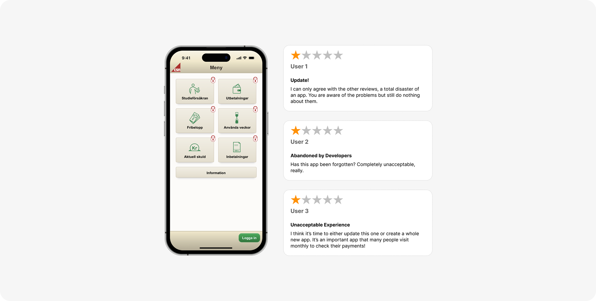
As of 2023, Mina sidor had only received minor updates and retained its original interface and functionality since its release in 2013. Despite its critical functions, the app was rated poorly (1.3 out of 5 stars on App Store), with users highlighting issues such as confusing navigation and an outdated interface. There certainly was a need for a revamp of the app.
Research
Identifying the Root of Negative Feedback
To improve the usability of Mina sidor, we conducted thorough research to uncover the issues contributing to negative user sentiment. We initiated our research by formulating two key questions:
‣ What are the underlying causes of the negative reviews on App Store?
‣ How can the app be redesigned for improved usability in terms of satisfaction, efficiency, and effectiveness?
Theoretical Evaluation
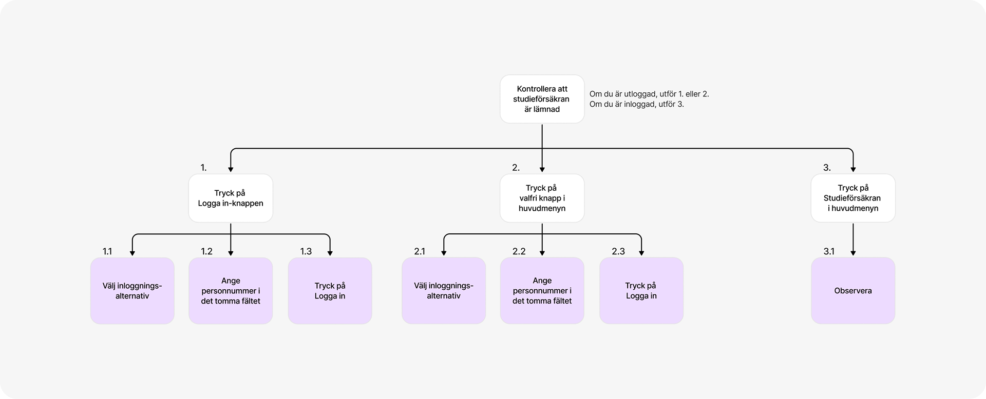
A Hierarchical Task Analysis (HTA) was performed on three tasks that covered a significant portion of the app's use cases and features.
Based on the HTA, we created six tasks with varying levels of difficulty, reflecting typical app interactions, for example: Check how much money you received in April 2023. Furthermore, using Cognitive Walkthrough, we could identify potential challenges and usability issues that could arise during the execution of these tasks.
Empirical Evaluation
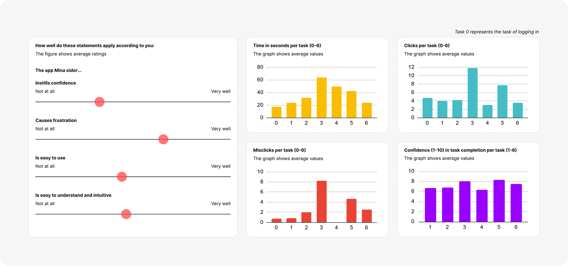
User testing of the old Mina sidor app was carried out with CSN service users (n=8), selected based on varying experience levels with the app. To ensure comparability (with the redesign), the tests were conducted on a mobile device, using a Figma prototype of the old app. Each participant completed two out of the six tasks. The user testing focused on assessing:
Satisfaction
Evaluated through initial impressions of the home page, where participants described their first impression and guessed the content of the buttons. Also assessed with post-task open-ended questions and a Likert scale questionnaire, covering aspects such as feeling of security, frustration and ease of use.
Evaluated through initial impressions of the home page, where participants described their first impression and guessed the content of the buttons. Also assessed with post-task open-ended questions and a Likert scale questionnaire, covering aspects such as feeling of security, frustration and ease of use.
Efficiency
Measured by the time taken and the number of clicks required to complete each task.
Measured by the time taken and the number of clicks required to complete each task.
Effectiveness
Determined by task completion accuracy (misclicks, errors) and the need for assistance. Participants also rated their confidence (1–10) in task completion and provided feedback on intuitiveness, ease of finding answers, and any difficulties encountered.
Determined by task completion accuracy (misclicks, errors) and the need for assistance. Participants also rated their confidence (1–10) in task completion and provided feedback on intuitiveness, ease of finding answers, and any difficulties encountered.
Additionally, we conducted a separate online survey (n=65) to gather insights on how frequently CSN services are used and which features are most accessed.
Insights
Key Usability Challenges
The research phase uncovered several usability issues that consistently undermined the overall user experience and app functionality.
Outdated Visual Design
The app's outdated appearance made users uneasy, which reduced their willingness to input personal information, including login details. Additionally, the inconsistent design compared to the website created further mistrust, resulting in low satisfaction and the impression that the app was neglected.

Login Confusion
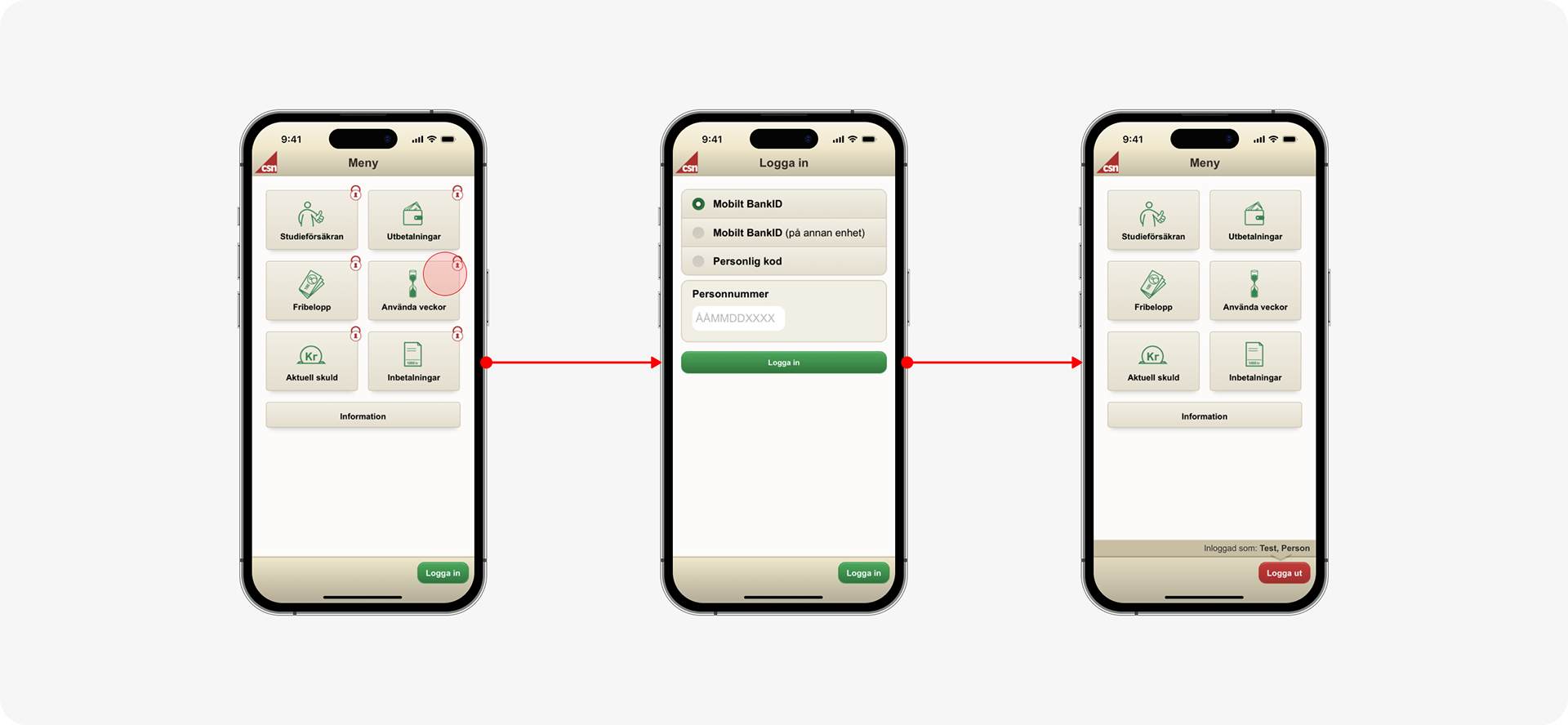
On the home page, users often bypassed the Logga in (Log in) button, choosing instead to click on menu buttons with lock symbols. This created confusion, as the lock symbols didn’t indicate that login was required. Furthermore, after logging in through one of the menu buttons, users were redirected back to the home page instead of the intended page. This misalignment with user expectations led to additional frustration.
Illogical Lists and Dropdowns
Users found information presented in lists difficult to access and perceive, often misreading or completely overlooking it. Very long lists and mixed chronological order compounded this issue, resulting in frustration and decreased satisfaction as users struggled to locate relevant content.
Lack of Explicitness
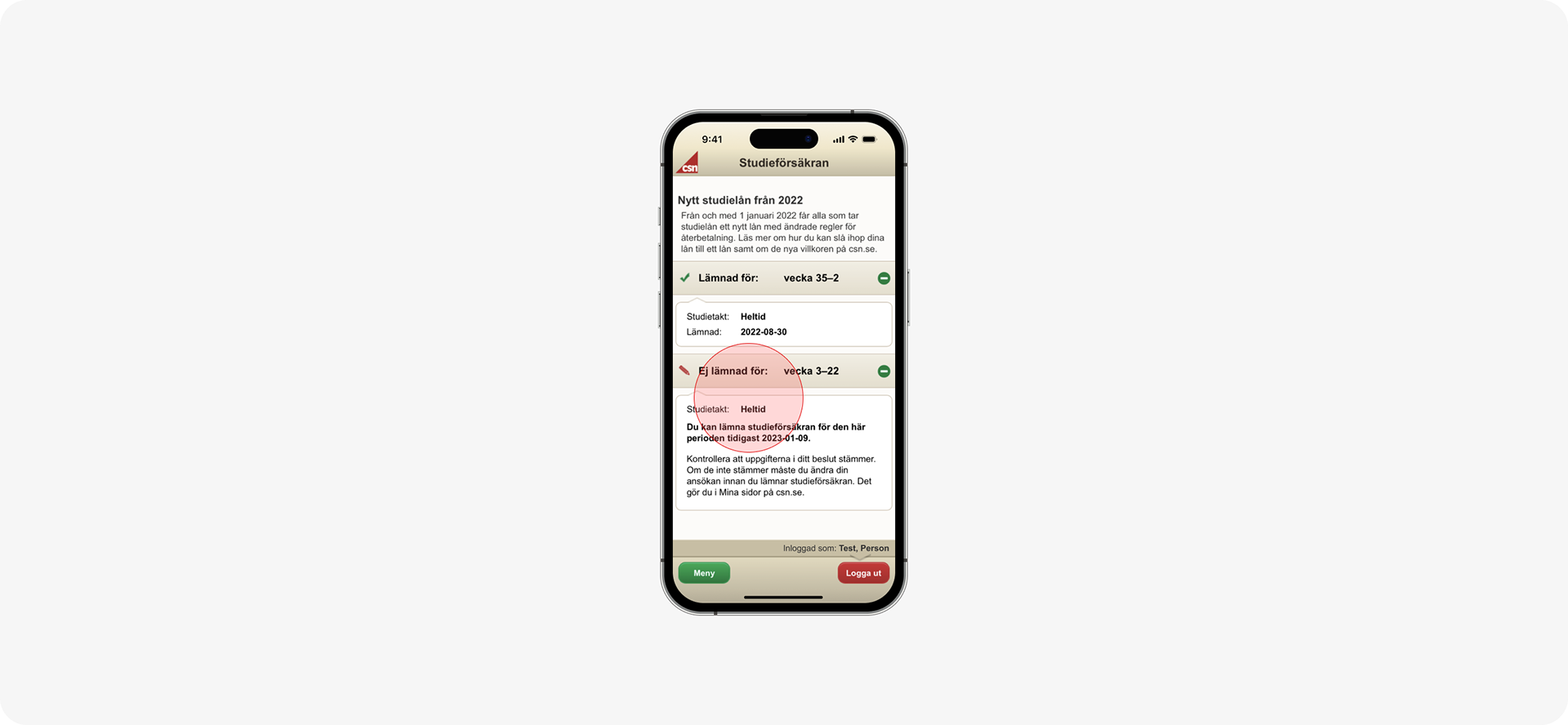
Many users encountered difficulties with the features on the Studieförsäkran (Study assurance) page. Many attempted to submit their study assurance when it was not yet possible, and others struggled to understand when submissions were possible. Moreover, the most urgent item that needs to be addressed is located at the bottom, which conflicts with users' mental models of how it should be arranged.
Ideation & Concept Development
Revitalising Mina sidor
The ideation process focused on exploring innovative solutions to tackle usability challenges and reinvigorate the app’s design.
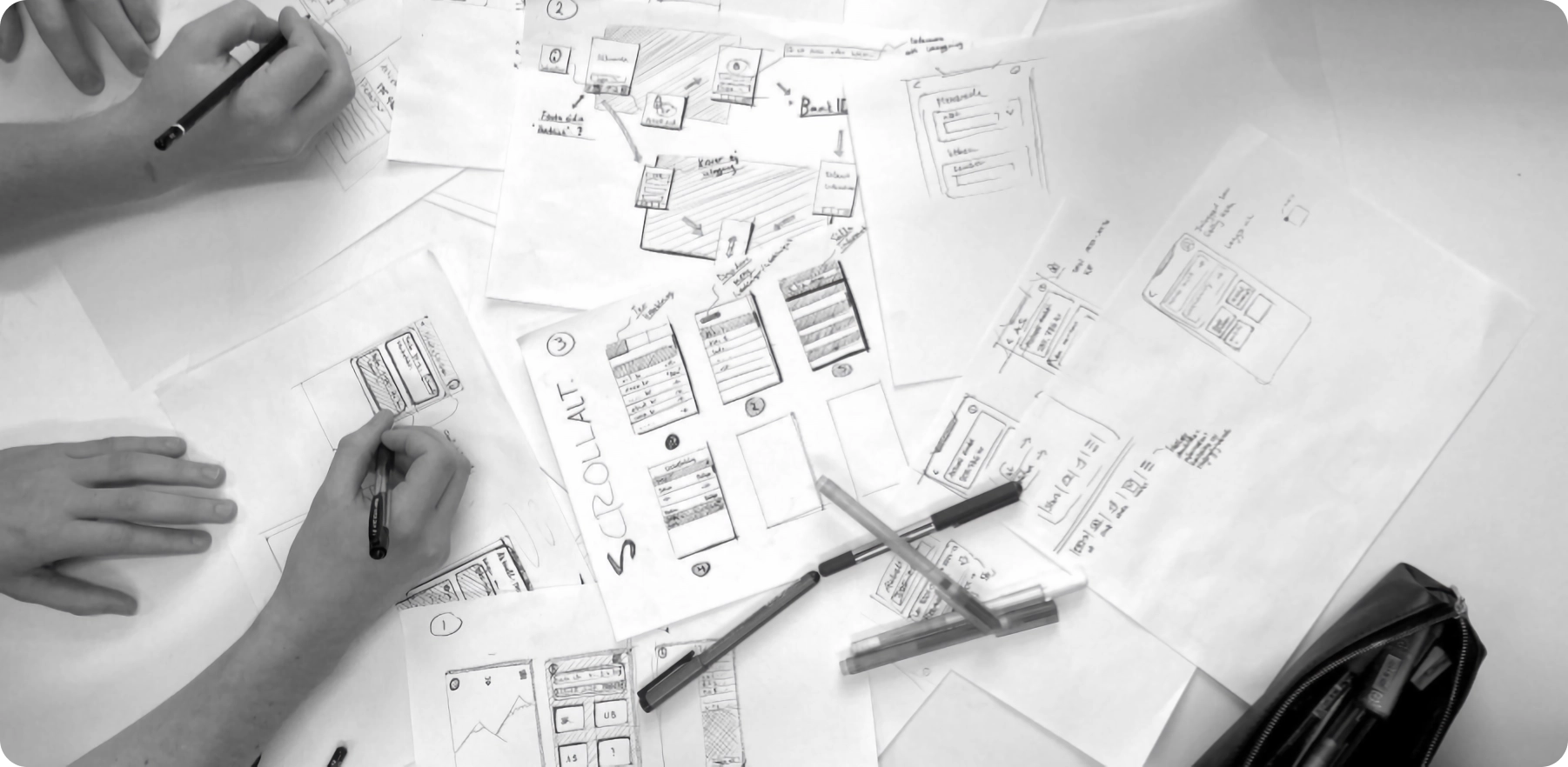
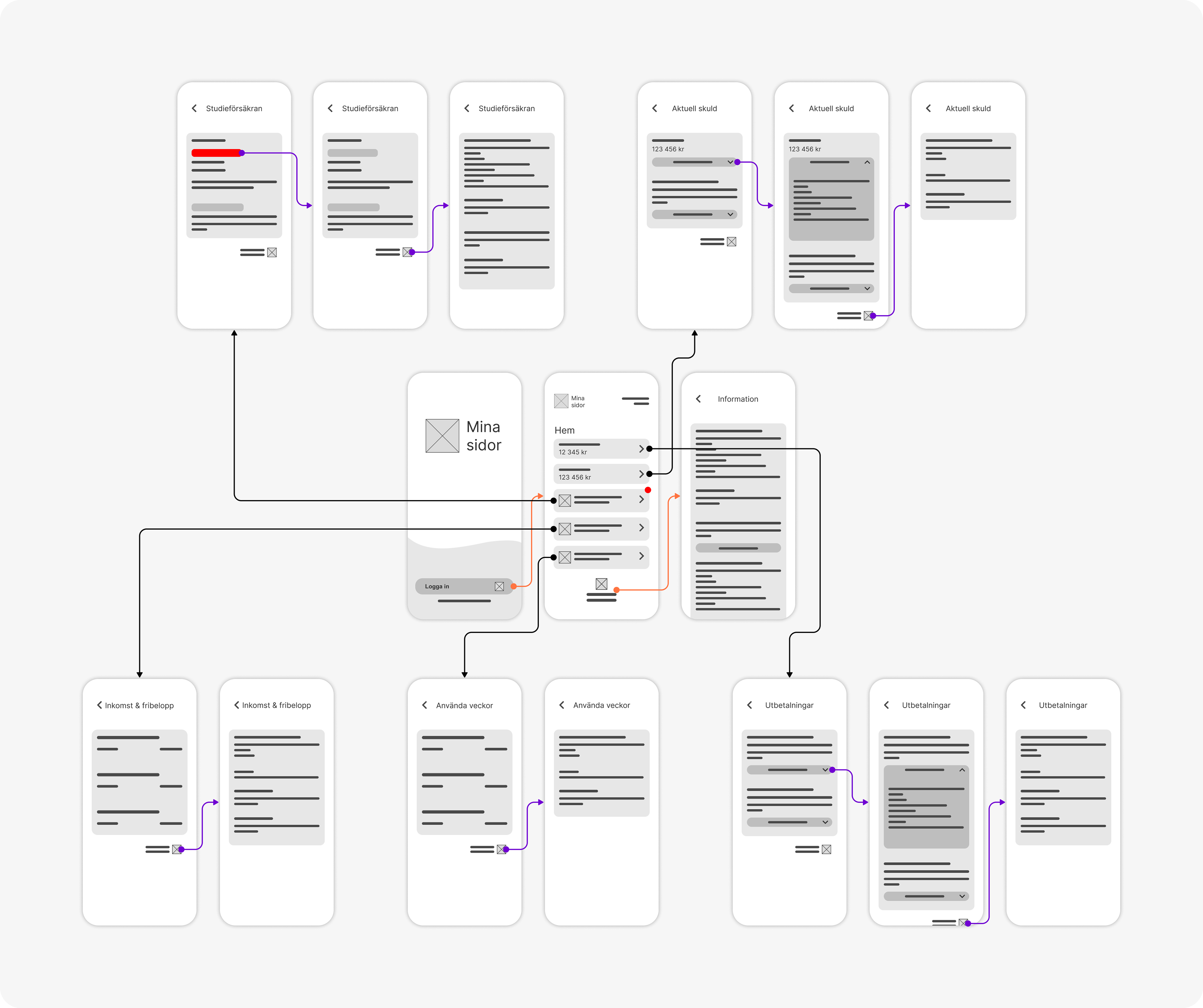
Wireframing
Through brainstorming, we created analogue wireframes that provided a broad overview of potential page structures. Multiple options were quickly developed and compared, emphasising layout over design elements. We refined these ideas to establish an initial structure for the app and user interactions, resulting in a Wireflow that highlights the new, shallow, and accessible framework.
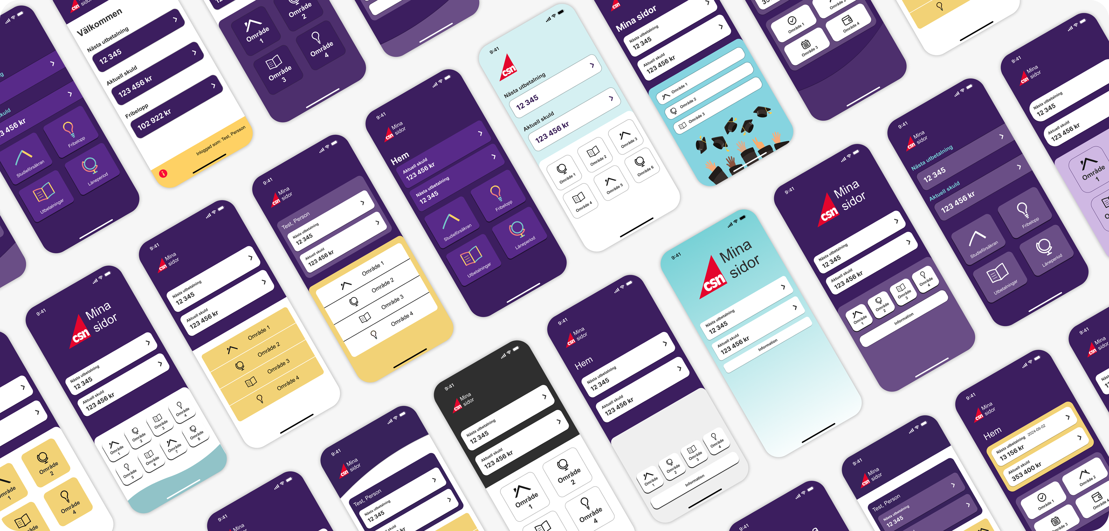
Mockups
With the wireframes and structure in place, we progressed to developing high-fidelity mockups, guided by CSN’s branding guidelines for colour, typography, and visual style. We conducted quick guerrilla surveys to gather user feedback on intuitiveness, clarity, and aesthetic preferences, which ultimately informed the selection of the final theme for the redesign.
Final Design
An Effortless Experience
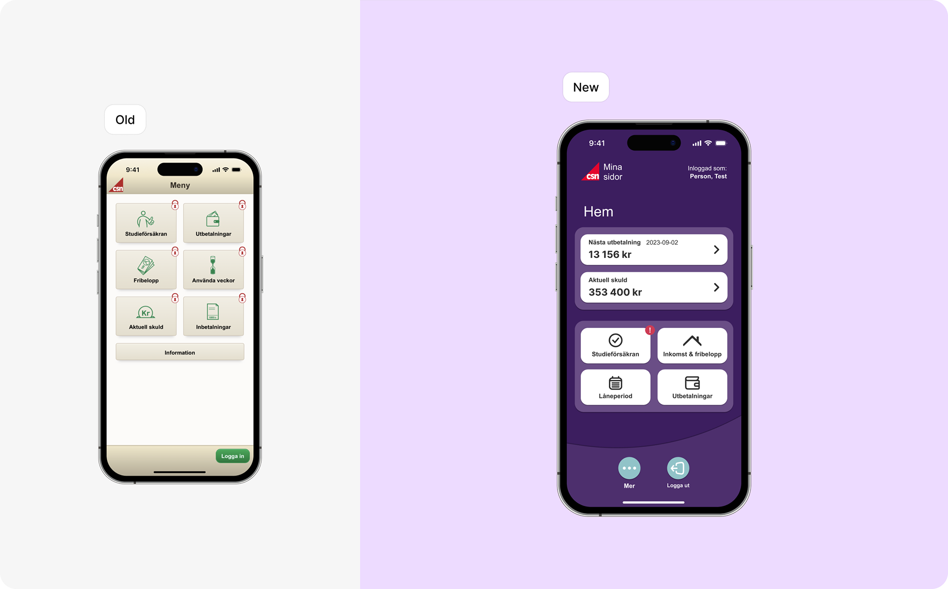
The app has adopted a more modern look, aligned with CSN's graphic profile, establishing a vital connection to the website and enhancing reliability.
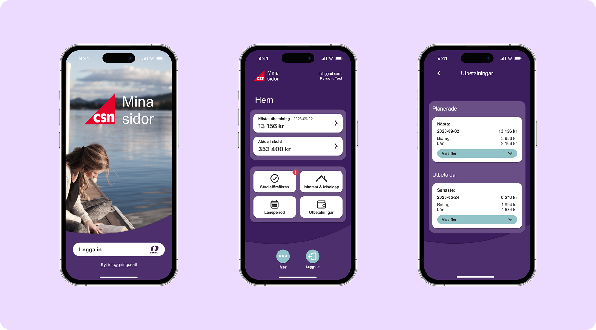
Login Page
The login page has undergone significant improvements in information accessibility and appearance. We clarified the user’s task by reducing alternatives to minimise confusion. The BankID symbol serves as a signifier, effectively guiding user interactions by following industry standards.
Home Page
The home page retains its primary buttons, showcasing strong contrast and ample clickable space. We grouped buttons to consolidate similar functions and prioritise essential information. Key details, Nästa utbetalning (Next payment) and Aktuell skuld (Current debt), are prominently displayed based on survey results about CSN usage. Additionally, we implemented two pathways to access the Utbetalningar (Payments) page, as it was the most frequently used page.
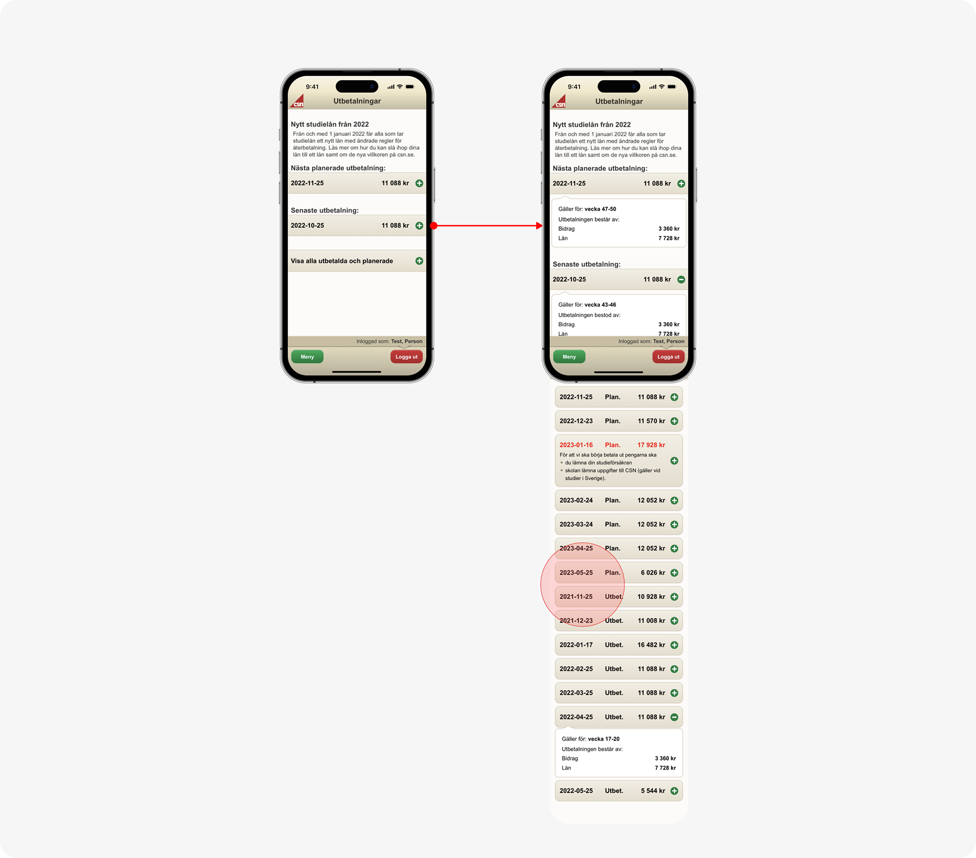
Expandable Lists
Information on the Utbetalningar page, formerly presented in a single list, has been divided into Planerade (Planned) and Utbetalda (Paid) sections. This change allows users to locate relevant details more efficiently and with greater confidence. The most critical information is now visible without having to open the scroll list, and items in each list have been reordered to display the most current information at the top. We adopted the same structure for all pages with lists.More Information
Information previously found under Vanliga frågor (FAQ) on the Information page has been relocated to each relevant page under the Mer information (More information) button. We intentionally made the button size small to encourage users to scan the page first before noticing it.
Buttons and Signal Colours
To promote visual clarity during critical actions such as submitting the study assurance, we utilised notifications and signal colours that stand out from the rest of the app. Conversely, the interface indicates urgent information, such as when the study assurance can or cannot be submitted.
Impact
Measuring the Success
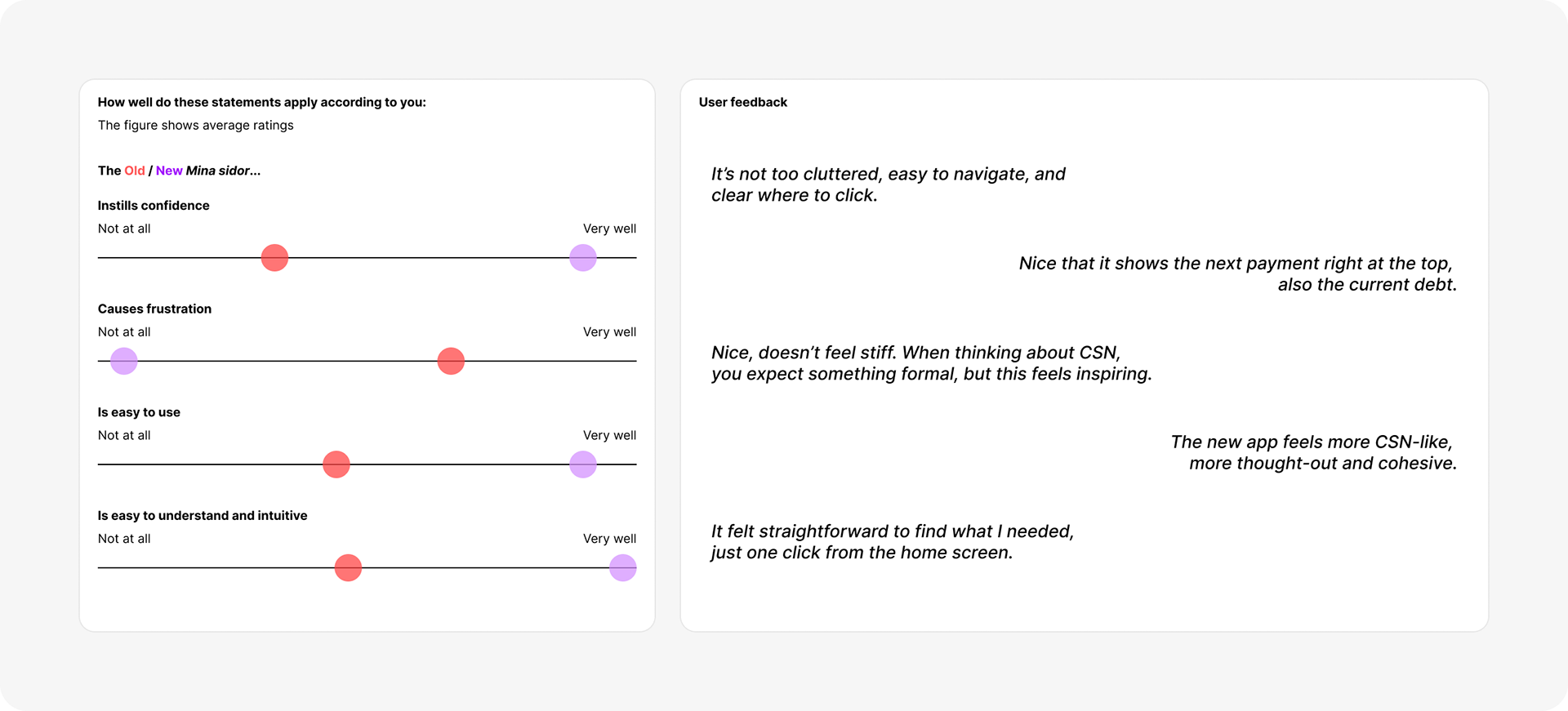
The redesign was tested with a new group of users (n=8) to measure improvements compared to the original app, using the same testing procedure. The test revealed significant results (averages):
‣ Task completion time decreased by 46% (35.8➞16.5s).
‣ Clicks per task decreased by 47% (5.55➞2.60 clicks).
‣ Errors per task decreased by 58% (2.71➞1.57 errors).
‣ Self-reported confidence in task completion increased by 32% (7.3/10➞9.6/10).
These reductions in time, clicks, and errors indicate improved efficiency, while increased confidence reflects greater user satisfaction. The number of participants unable to complete a task fell from 3 to 0, demonstrating improved effectiveness. Moreover, the redesign showed significant enhancements in ratings related to confidence and frustration, alongside notable improvements in ease of use, clarity, and intuitiveness. These factors collectively reflect an overall increase in user satisfaction.
Final Thoughts
Key Takeaways and Learnings
The research revealed that negative reviews primarily stemmed from the app’s unattractive and outdated appearance, alongside a confusing structure that frustrated users. In terms of redesign, improving usability involved intuitive placement of functions and prioritising key features. Aligning interface elements with users' mental models and familiar symbols was also crucial. Personally, this project gave me some valuable insights:
There is a lot of value in user feedback. While initial theoretical insights were helpful, direct conversations with users brought deeper understanding and revealed nuances that weren’t initially apparent. This highlights the importance of continuous iterative research in ensuring accuracy and addressing user needs.